TYPO: Hot Art Wet City

(Ice by Scott Sueme. Image Credit: Chris Bentzen
http://www.flickr.com/photos/chris_planb/12002144075/in/set-72157639876945793)


ECUAD Student Publication
Taking it’s name from the mischievous primate companion of Emily Carr, WOO is an experimental magazine which aims to showcase student artwork, criticism and creativity. Throughout ever-evolving manifestations, WOO has remained committed to creating publications which promote curiosity and reflect the temperature of the student body. The WOO team facilitates connections with established artists, curators, and alumni with the intention of engaging and contributing to the surrounding arts community. Submissions are accepted 3 times a year for printed editions, and we encourage feedback and written submissions for blog content throughout the year.

(Ice by Scott Sueme. Image Credit: Chris Bentzen
http://www.flickr.com/photos/chris_planb/12002144075/in/set-72157639876945793)


(image credit: http://www.flickr.com/people/cobalt/)
3 Habits of Successful (or Happy) Creatives
by Jessica Molcan
Social media has an influx of articles on the “7 Habits of Healthy Couples” and “25 Things Happy People Do” juxtaposed against couples holding hands and young women doing yoga off the sides of cliffs. In the grand tradition of this viral article style, I have compiled a list for creatives. Take this with a grain of salt, or perhaps print out the semi-inspirational photograph from the top of the article and make it your new wall poster above your studio.
1. Good artists borrow, great artists steal
I’m not talking about appropriation as much as I’m talking about feeding your inner artist. Many artists are petrified about looking at other work in their field because they may become disheartened because someone else has already come up with the idea they were mulling over. Perhaps that’s the wrong way to look at it. Instead, take what you like about a work and make it work for you. This can be beneficial in helping find what works and what doesn’t, what can help you improve as a creative, and what may hinder you. Don’t copy a brushstroke for brushstroke or rip-off a design down to the Pantone colour swatches. It’s all about balance. Expand your creative horizons and feed your soul.
2. Get back into the studio
This isn’t a “work more” advice article. You don’t need to work harder or create more, but you do need to get better at what you do. Fine tune and hone your skillset. Make better work, not more work. Keep in mind that while you try to better your vector skills in Illustrator, you may produce a lot of crap work. That’s okay, embrace the failures. Failure is essential for growth. Know that when you’re in the studio honing your craft, you’re listening to the little voice inside you that says that this is what you’re meant to do. It also reminds you of the importance it holds to your life. Take some time outside of class schedules and homework, no matter how little, and work on your own art practice - or work on something you love doing. Sometimes it’s so easy to get lost in all the assignments, we forget about what we actually love to paint, draw, photograph, or design.
3. Learn to let go
All artwork involves emotion, but an emotional investment in your work is not the same as being emotionally attached to your work. Being able to objectively look at your work and step back requires being back to distance yourself from your work. Invest in yourself, but don’t be afraid to let the work go when you’re finished. You’ve created something and it is a piece of you, but letting go allows you to move forward and create bigger or better things. It’s important to pour yourself into your work, but you must pull yourself back out. Whether this is to handle university critiques, or to sell your work to a stranger, you can’t allow an emotional connection to your own work cloud your judgement as to whether or not it’s a good piece or work. A good practice to pick up is to share your work within social media. Finished or unfinished, putting your work out there and then moving on helps distance the emotional attachment.
Feel free to add your own tips below.

JOIN THE WOO!!!!
Ever wonder about the process of creating a publication?
The WOO provides extremely valuable skills and knowledge that will set you apart in your field… SO join the WOO!
We need Designers, Editor, PR managers, and Print Managers
Fill out this application form and email it to woo@ecuad.ca
DEADLINE: January 29!
https://www.dropbox.com/s/bcjrh4kuuok9g1u/WOO_Aplication_2014_form.pdf
Saturday, 14 December; Coquitlam BC
By Omar Linares
Images courtesy of Tong Guan
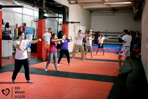
Although Stand Up gym is a few blocks walk from the Lougheed Skytrain, participants were not deterred from the Muay Thai workshop. Tony Strong taught the basics of punching, kicking, and blocking, but most importantly giving back to the community. The workshop was part of a fundraising event for the Do What U Luv campaign, a community based organization founded by Emily Carr industrial design student Tong Guan, its aim is to provide creative and physical activities for youth who can’t afford it.
Concerned with the decrease in funding for education in BC, particularly of fitness and art programs, Tong has gone beyond school walls to help improve young people’s lives. As a part of this, the Muay Thai class was part of series of dance flash-mobs, workshops, and photo-shoots leading to the instauration of dance and martial arts programs. In January Do What U Luv will impart workshops at different schools in the lower mainland, in first instance in the Surrey School District and its 120 schools.
For this operation Guan has reached to several partners, from corporate sponsors to fellow charities, like Big Brothers who were already in the lookout to impart physical activity programs, yet the main partners of the Do What U Luv network are committed instructors like Tony Strong.
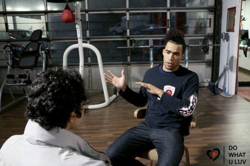
A childhood fan of action films, nonetheless, Strong’s main inspiration has been his brother and fellow mentor Krus Williams and his desire to give back the help he got when growing up. Thus, since his teenage years Strong has volunteered with a number of charities frequently in his role of Muay Thai instructor. Some of his latest collaborations have included the Breakfast Club of Canada, BC Children’s Hospital, and Parkinson Society British Columbia; in this sense, his partnership with Do What U Luv is special as it not only helps a cause but one that is young in terms of its promoters and beneficiaries.
Strong explained, that although the events vary in size his focus has always been on quality over quantity, with some of the participants becoming committed members of the Stand Up team. This seemed to be the case of Devon Marsland, who partook in the introductory exercises and said he would enroll at Stand Up Muay Thai instead of boxing; like many other attendants he benefited from the entrance by donation for training similar to that of school beneficiaries. Indeed, Guan describes physical activity of the Muay Thai workshop and other events of Do What U Luv as central, “the whole point is to feel comfortable about their body…to push confidence and self-esteem.”
The name of both the well-being organization and the Muay Thai gym reflect the dynamic take on improving people’s lives through, literally, action. Like Guan’s, Strong’s approach to community involvement is local and intrinsic to the participants’ knowledge, or as Strong puts it, “people don’t know how much you know, until they know how much you care.”
To find out more visit:

By Jessica Molcan
What to do with your finished artwork
It’s the end of the semester and the “end of semester clean up” notices are papering the hallways. For those in painting and drawing, sometimes it’s hard to figure out what to do with all the pieces you create over the course of the semester. There are a few options, of course. Bring them all home to your cramped apartment and try to fit them on your walls, put them in storage, or ship them off to parents or buyers (we can hope). Here are a few tips for shipping or storing your artwork in a way that’ll keep it the safest.
Shipping Artwork
The most economical way to ship your canvas based works is to take them off their stretcher bars, roll them up and slide them in a cardboard tube. Wrap that tube in bubble wrap and slide it into a slightly larger PVC tube. Finally, tuck the stretcher bars inside, also wrapped in bubble wrap. It’s safe and not too expensive to ship. However, if you can’t take your painting off its stretcher bars, or it’s on panel, you’ll have to ship it otherwise. There are a few tools that you’ll need to get started: box cutter, packing tape, cardboard, and bubble wrap.
It’s unlikely that you’ll find boxes that perfectly fit your work. It’s much greener to grab some for free from Craigslist and use the cardboard to make it fit your work perfectly. Essentially, you want to protect the work, so wrapping it in bubble wrap is the first step. Brace the back and front with pieces of cardboard, secured it with tape. Finally, make a box to fit around the entire piece. Voila! Your piece will make it to its destination unharmed.
However, shipping costs can add up, and we are students on a budget. If you have a place to store your work, there are ways to store it that are archival and will prevent damage.
Storing Artwork
There are a few important things to remember when you store your work. First, you should never store your artwork near windows, doors, vents, or ceiling fans. Keep the work elevated off the floor by using bins or pallets, keeping space and cushion between the works. Three-dimensional works should be stored on padded shelving, with the heaviest work at the bottom.
It’s not ideal to stack artwork, but if you find you have to stack works, use cardboard barriers that are larger than the artworks. It is best to stack them front to front and back to back, and keep the stacks short. It is never a good idea to stack a painting that is not stretched on a frame, because an unframed painting is more vulnerable.
Finally, storing unmatted, loose art such as drawings, prints and illustrations; ideally should be kept in shallow drawers or cabinets. These areas have less chance of weight build up and scuffing of the work. Try to store similar sized pieces together with glassine or slip sheets in between them, and keep any acidic materials away from them.
Hopefully these tips will help you for an easy end of semester clean up!
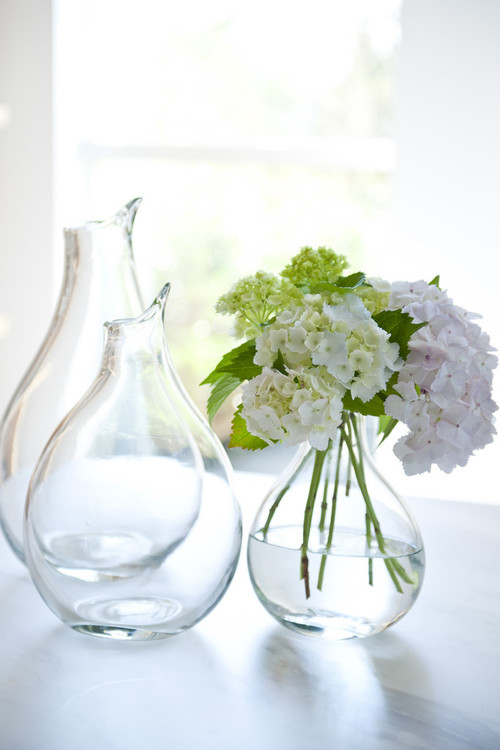
Conversation between flower and vase.
by Farrah Olegario Nazareth
Dip me once, I will drink
Tip me once, I will pour
Keep me single, I will glow
Tip me over, I will flow
I may like a friend or two
I can quench a mini crew
When at times I feel bored
I can think of other modes
I can stand, and look tall
I can bend, and look strong
You can do many more
Really? Look like a Christmas decor?
Actually, yes, for sure, for sure
Get filled with lights and shine, adore
Wow! I never thought of that
What else trumps that?


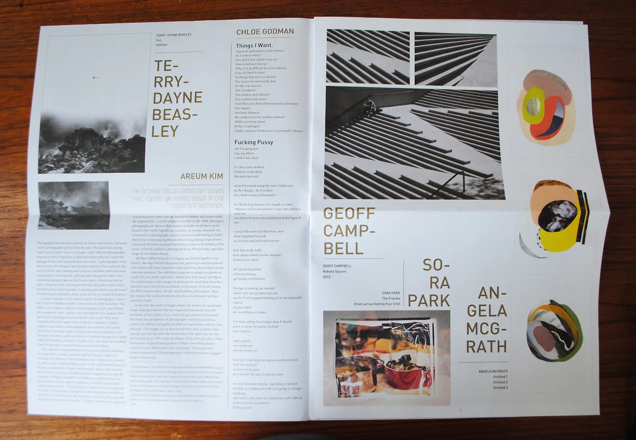
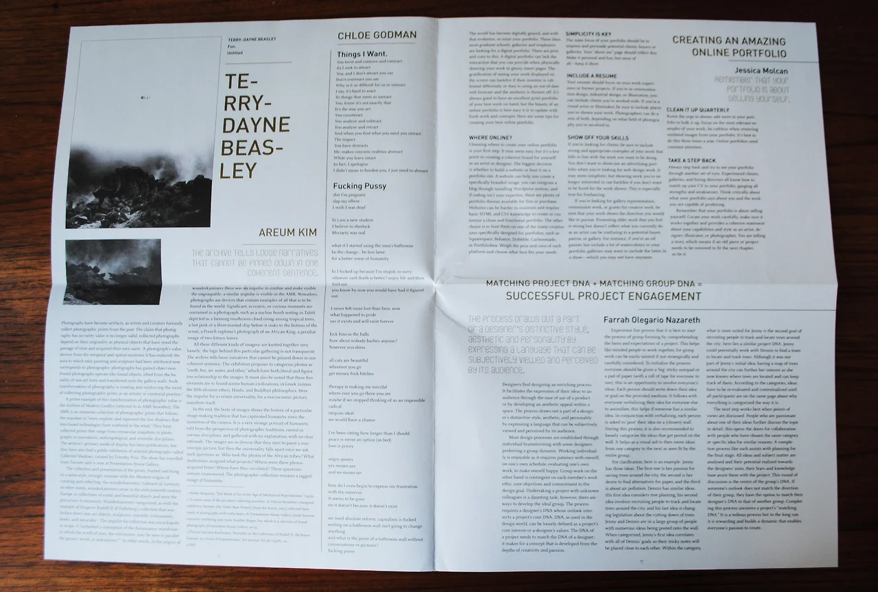

Here is some of our last issue..incase you missed it!
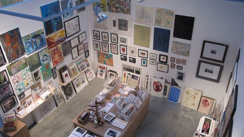
Student art sale photo: ecuad.ca
Winter Events By Jessica Molcan
With the holidays rampantly approaching, art events are popping up everywhere in Vancouver. If you’d like to start your holiday shopping early, you should support local artists and hit up some of these events to find handmade products, original art and so much more created by artisans. You can also check out these events to get a feel for the annual events that take place in Vancouver that you may also want to be a part of.
First and foremost, the Emily Carr Student Art Sale begins Friday, November 22 and runs until Sunday, November 24th. Admission is free and you can support your peers. It’s also the annual sale’s 40th birthday party! There will be a fantastic selection of original artwork, photographs, prints, ceramics, sculpture, wearable works, housewares and more. For more information, including hours: http://www.ecuad.ca/about/events/ 302458
Similarly, the Make it! Craft & Art Fair takes place the following weekend starting Thursday, November 28th and running until Sunday, December 1st. Located at the PNE Forum, tickets are $7, or you can save $2 by getting your ticket online. Showcasing over 250 artists and artisans, you can find incredible one-of-a-kind handmade items and there’ll be something for everyone. For more information, including hours and where to buy a ticket: http://www.makeitproductions.com/
If you’re looking to do something this weekend, the Eastside Culture Crawl that is centered between Main and Victoria (from Powell to Terminal) starts Friday, November 15th and runs until Sunday, November 17th. There are over 400 artists taking part in this visual arts, design and crafts festival. A map, list of artists and buildings are all available online: http://www.eastsideculturecrawl.com
Finally, a weekly event that occurs on Wednesdays is SNAG at the Cobalt (917 Main St). Each week, four artists ranging from up and comers to well known in the Vancouver art scene paint live all night. At the end of the night, the paintings are raffled off. Admission is free, and the raffle tickets start at $5. Bonus - every third Wednesday, they also do complimentary life drawing. Check out more here: http://www.thecobalt.ca/ monthly-events/
Know of any cool events? Comment below!
by Omar Linares
a.Proteism: Hanky Panky and T’art
or
Prelude to the Planet
Between 1983, the last The Paper, and 1986, the year of the first Planet of the Arts, there is a gap in the student publication archives; nonetheless, some student publishing seems to have taken place in this period. One clue is the mention by Naomi Singer, co-founder of Planet of the Arts (1986-1998), about small sporadic publications by Douglas Coupland during her first year of studies (1985) at Emily Carr (although these may have been Coupland’s version of The Paper [2013, Interview]); another clue is a single copy of an anonymous zine titled Hanky-Panky, dated between 1985 and 1986.
Hanky Panky was the name sole editor “J. Jungle” gave to a publication comprised of a messy, barely legible, and anonymous collage of images and text ordered in the manner of a stream of consciousness. There is nothing to suggest that Hanky Panky had previous issues or continuity. Its form and content were spontaneous and satirical; among the zine’s material were news of the withdrawal of Dean Tom Hudson, yet this news might have been a parody. As in such case, the anonymity of the zine prevents judging the community’s involvement, since Hanky Panky did not address the students at Emily Carr (or at least not explicitly).
Aside from anonymous collage, the decade brought an alternative to the then prevalent newsletter format: T’art. Edited by Violet Finvers in 1987, a year after the first Planet of the Arts, T’art geared towards a magazine design with a coherent and legible layout. Its contents, although it not exclusive to student journalism, were critical of the institution; for instance, it voiced concerns such as the equipment of the film department and the separate location of the painting students’ studios. This material coexisted with articles on social concerns, art, music and creative writing; in addition, illustrations and cartoons, although scarce, were emphasized in tandem with the written content.
Although Finver’s editorial suggested aims of continuity, there are no more copies of T’art and nor is there mention of it in its contemporary 1987 volume of Planet of the Arts. Retrospectively though, the format and emphasis of T’art would return and prevail in the later magazine publications of the 2000’s.
(to be continued…)
By Omar Linares
Part II: Towards Student Autonomy
b. The Paper
From its origins The Paper (1981-1983) was a prolific and student partisan newsletter. Its ties with the Student Society would be the closest of which there is record as it practically became its official publication, releasing information on the activities, budget, clubs and campaigns promoted by the Student Society.
Only two issues from the first volume (fall 1981) are archived; however, the format, mandate, and editors occurred in this phase of the publication. Worth noting is the participation of former WOO editors Laiwan Chung (for volume I) and especially that of Arni Haraldsson; the latter, along with Chris Bradshaw and Pieter Kos, had a prominent involvement in the second volume of The Paper. Evidence of this was the constancy of their columns, a characteristic of the newsletter, where criticism of school policies and proselytism for students was voiced along news on the political and artistic happenings of school and of issues affecting students. Often times The Paper took an active part on these conflicts, like administrative policies and budget cuts; an example of this was the cancellation and restoration of free life drawing sessions for students (vol.2 #’s 6 & 7). This proselytism by The Paper was possible due to its frequency of publication (even twice a week) which was viable by the economic format chosen for the newsletter’s purposes (vol.2 #1). Surprisingly, despite The Paper’s activism and advocacy for students, only in the final issues of volume two was there a direct response from the student community; for instance, in the form of letters to the editor and articles on the quality of the school’s teaching system (vol.2 #’s 6-9). Additionally, contributions by the students were in their majority journalistic, with scarce creative writing and little or no graphic artworks; it would be until the subsequent volume that Douglas Coupland would explore The Paper’s creative potential.
It is somewhat inaccurate to classify Coupland’s editions as a continuation of The Paper since a later volume is numbered as such and also because he changed the name of each issue seemingly at will; additionally, his appointment as editor is (from an archival perspective) somewhat unexpected, given that he had only contributed some fictional work to The Paper’s second volume (vol.2 #1) and was absent during the prolific work of Haraldsson, Bradshaw, and Kos. Nonetheless, Coupland maintained the publication’s general format, layout, focus on school news, and Student Society viewpoints (he seems to have been a Student Society representative).
At the same time he deviated from the criticism of the school administration and instead emphasized the creative aspect of the publication, transforming The Paper into a playful literary artifact that included a diversity of themes and supplements such as pages from books, “Scratch and Sniff” stickers, different covers for the first issue, acrostic puzzles, and others devices. Still, visual artworks remained scarce. Also, Coupland’s was a prolific and creative production (he appears to have been the sole editor and at times sole contributor), releasing at least five issues for a full school year (Fall 1982-Spring 1983), compared to the past two volumes of The Paper, whichhad spanned only one term each.
After Coupland’s editorship, the officially termed volume three of The Paper appeared late in the fall of 1983. Instead of the usual small sized newsletter its format was a big and dense zine, and while former editors Douglas Coupland and Chris Bradshaw contributed a couple of writings, it was produced by a new editorial team. School news, opinion articles, and student information were present but criticism towards the administration languished, as so did the proximity with the Student Society; on the other hand, the publication increased its creative writing and graphic content with a whole comics section by Emily Carr’s animation department. If this move from journalism and newsletter format resulted in a major engagement it is unknown as there are no further records of the third volume or any more volumes of The Paper. Later archival records present a phase of sporadic experimentation but it would be until two years later that another solid student publication will circulate through Emily Carr.
(to be continued…)